> ## Documentation Index
> Fetch the complete documentation index at: https://docs.prelaunch.online/llms.txt
> Use this file to discover all available pages before exploring further.

# Roadmap Feature

> Showcase your product development plans and future features

## Roadmap Feature Overview

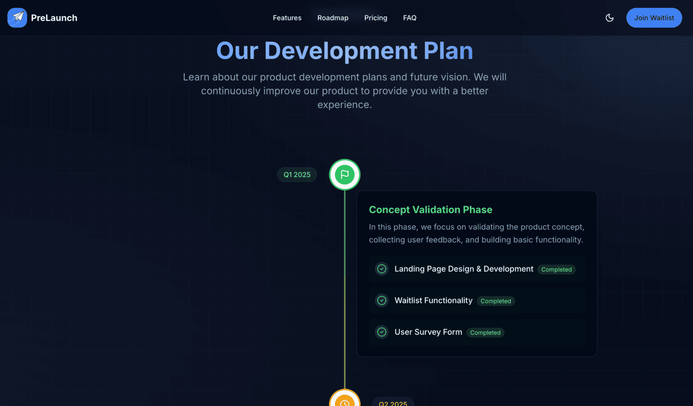
PreLaunch includes a built-in roadmap feature that allows you to showcase your product development plans and upcoming features to potential users. This creates transparency and builds trust with your audience by demonstrating a clear vision for your product's future.

<img src="https://mintcdn.com/maplegroup/jgEMOrBdhouQZGGT/images/roadmap-demo.png?fit=max&auto=format&n=jgEMOrBdhouQZGGT&q=85&s=a32b9739df43c92cd2ee8e6df4a2845c" alt="Roadmap Feature Example" width="1405" height="823" data-path="images/roadmap-demo.png" />

## Benefits of Displaying a Roadmap

* **Build User Trust**: Show that you have a clear vision and plan for your product
* **Set Expectations**: Let users know when to expect new features
* **Increase Engagement**: Keep potential users engaged by showing what's coming next
* **Gather Feedback**: Use the roadmap to prompt feedback on planned features
* **Showcase Progress**: Highlight your development momentum and activity

## Implementation

PreLaunch's roadmap feature can be easily added to your landing page using the built-in components:

### Basic Roadmap Component

```tsx theme={null}
import { Roadmap } from '@/components/landing/Roadmap';

export default function RoadmapSection() {
  return (
    <div className="roadmap-section">
      <h2>Product Roadmap</h2>
      <p>Here's what we're planning to build in the coming months</p>
      
      <Roadmap />
    </div>
  );
}
```

### Milestone Component

For a more customized roadmap, you can use the individual milestone components:

```tsx theme={null}
import { Milestone } from '@/components/landing/Milestone';

export default function CustomRoadmap() {
  return (
    <div className="custom-roadmap">
      <h2>Our Development Journey</h2>
      
      <div className="milestones">
        <Milestone 
          title="Beta Launch"
          date="December 2023"
          status="completed"
          description="Initial release with core features"
          features={[
            "User authentication",
            "Basic dashboard",
            "Email notifications"
          ]}
        />
        
        <Milestone 
          title="Version 1.0"
          date="February 2024"
          status="in-progress"
          description="First stable release"
          features={[
            "Improved UI/UX",
            "Advanced reporting",
            "API access"
          ]}
        />
        
        <Milestone 
          title="Version 2.0"
          date="Q2 2024"
          status="planned"
          description="Major feature update"
          features={[
            "Mobile app",
            "Integration with third-party services",
            "Collaborative features"
          ]}
        />
      </div>
    </div>
  );
}
```

## Configuration

### Configuring the Roadmap Data

The roadmap data is configured in the `components/landing/Roadmap.tsx` file. You can modify this file to update your roadmap timeline:

```tsx theme={null}
// Example roadmap data structure in Roadmap.tsx
const roadmapData = [
  {
    title: "Phase 1: MVP",
    date: "Q4 2023",
    status: "completed",
    description: "Launch the core product with essential features",
    features: [
      "User management",
      "Basic analytics",
      "Content creation tools"
    ]
  },
  {
    title: "Phase 2: Growth",
    date: "Q1 2024",
    status: "in-progress",
    description: "Enhance the product with user-requested features",
    features: [
      "Advanced analytics",
      "Team collaboration",
      "Integration APIs"
    ]
  },
  // Add more phases...
];
```

### Customizing the Roadmap Style

You can customize the appearance of the roadmap by modifying the Tailwind classes in the roadmap components or by creating your own custom styles.

## Integrating with Voting System

One of the most powerful features of PreLaunch is the ability to integrate the roadmap with the user voting system. This allows you to display features that users have voted for in your roadmap:

```tsx theme={null}
import { Roadmap } from '@/components/landing/Roadmap';
import { VotingResults } from '@/components/VotingResults';

export default function RoadmapWithVoting() {
  return (
    <div className="roadmap-section">
      <h2>Product Roadmap</h2>
      <p>See what features we're building based on your feedback</p>
      
      <Roadmap />
      
      <div className="voting-results mt-12">
        <h3>Most Requested Features</h3>
        <VotingResults limit={5} />
      </div>
    </div>
  );
}
```

## Best Practices

* **Be Realistic**: Only include features and timelines that you're confident you can deliver
* **Update Regularly**: Keep your roadmap current to maintain trust with your audience
* **Balance Detail**: Provide enough information to be useful, but don't overpromise specific details
* **Highlight Progress**: Clearly mark completed items to show momentum
* **Include User Input**: Show how user feedback has influenced your roadmap

## Common Questions

<AccordionGroup>
  <Accordion title="How frequently should I update the roadmap?">
    Update your roadmap whenever there's a significant change in your plans or when you complete a milestone. At minimum, review and update it monthly to keep it current.
  </Accordion>

  <Accordion title="Should I include specific dates?">
    For near-term items, specific dates or months can be appropriate if you're confident. For longer-term items, using quarters (Q1, Q2, etc.) or general timeframes provides flexibility.
  </Accordion>

  <Accordion title="How do I handle delayed features?">
    Be transparent about delays. Update the roadmap with the new timeline and consider adding a brief note explaining the change. This builds trust even when timelines shift.
  </Accordion>
</AccordionGroup>

## Related Links

<CardGroup cols={2}>
  <Card title="User Voting System" icon="thumbs-up" href="/features/voting">
    Learn how to collect user votes for feature prioritization
  </Card>

  <Card title="Customization" icon="brush" href="/customization/content">
    Learn how to customize your content and components
  </Card>
</CardGroup>
